23 December 2006

"It is not going to make the front of Architectural Digest"

[image: New York Times]

That's for sure. The Times has an article on the recent shift away from those iconic FEMA trailers and towards "cozier, more permanent models of postdisaster housing." While I can appreciate (in concept) a rejection of the FEMA trailer in favor of a denser, safer, and more effective strategy of reconstruction, the renderings seem a good deal less promising than the rhetoric. Exuding the false nostalgia of New Urbanism (DPZ anyone?), these new FEMA alternatives fail to offer a truly progressive and regenerative solution to reconstruction. The smaller detached models (middle image) seem to be nothing more than FEMA trailers with a little "contextual" wedding-cake decoration on the outside - much in the vain of the "Katrina Cottage" that has gained so much currency this past year.

To me, the failure of this approach is twofold. First, by superficially manipulating exterior decoration to mimic so-called "traditional" architecture, these proposals impose a certain order and aesthetic regime that no longer has any social, political, or cultural relevance. I would go further (as I have done previously) by saying that, intentionally or not, the aesthetic agenda of New Urbanism is ideologically aligned to the right-wing agenda of no-bid contracts, redistricting through "reconstruction," and other such undesirable practices encouraged by the powers that be in Washington.

Secondly, the solutions offered thus far perpetuate the flawed status quo of prefrabicated architecture that has remained in place since the very inception of modular construction. Instead of replicating the FEMA trailers, re-cladding them with white trim and gabled roofs, and in some cases stacking them on top of each other, why not use this chance to rebuild the Gulf cities as an opportunity to re-imagine what a prefabricated architecture could actually be? The merits offered by the panelized construction system of the Katrina Cottage have hardly been exploited, in the sense that they propose a new architecture - and, consequently, a real new urbanism - for the Gulf region.

Baby steps, though, I suppose: one at a time. At least this one - moving on from the FEMA trailer - is in the right direction.


link: "U.S. Give Grants to 4 Gulf States to Upgrade Disaster Housing" by Eric Lipton in the New York Times

04 December 2006

one year on.

Today Progressive Reactionary turns one year old. It was exactly a year ago when I sat down and decided to conduct an experiment: to start a blog about architecture, urbanism, and politics, and to see if it would go anywhere. I was (and remain) thoroughly convinced of the political potency of two separate realms -- the blogosphere and architecture -- and I saw this project as an experiment to link the two, with the hope of exploring what such an intersection could produce and how such potential could be further developed. Having recently graduated from architecture school and just beginning to practice professionally, I am (still) deeply committed to the political dimension of architecture, and the fact that the smallest creative act -- whether designed, drawn, or written -- has larger political repercussions that always must be taken into account. The blog was to become a forum to test these assumptions.

It should be said that there were two main factors that initially inspired Progressive Reactionary. The first is a general political ignorance at both the academic and professional levels of architecture culture that, for lack of better words, just drives me crazy. Ignorance breeds inertia, and the unbelievable lack of political engagement on behalf of architects -- practitioners of the most political of arts -- is simply unacceptable and, truly, unsustainable. The second inspiration was the ongoing debate on the role of pragmatism in architecture: specifically, the flurry of articles and theoretical treatises in recent years on the merits and inadequacies of so-called "critical" architecture. What seems to be a perpetual dilemma for architects -- to what extent one should operate within or without the machinery of global capitalism -- seemed to be a logical starting point for a blog on architecture and politics.

So I thought it would be worthwhile to take a moment and look back on this year. A recap, if you will. And maybe a little pre-cap for what's to come. Anyway, without further ado...

Progressive Reactionary began with a simple provocation: could it be possible to have a reaction of progress? In other words, could reactionary strategies pragmatically be applied to progressive causes?

Several themes emerged. Hurricane Katrina and the incredible -- if tragic -- opportunity it offered for some kind of progressive reconstruction of the Gulf region became an obvious topic of discussion, especially as such progressive prospects dwindled and such opportunities were lost. I found myself posting numerous diatribes on New Urbanism and its discontents, an issue that continues to fascinate me and that will surely surface again. Reconstruction at Ground Zero in Lower Manhattan became another target: the memorial design, the Freedom Tower , and the entire master plan have all devolved into artifacts of bureaucracy and poor leadership, and collectively they represent another missed opportunity.

Another recurring theme has been the work of Robert Venturi and Denise Scott-Brown, and their incredibly prescient embrace of architecture's capacity for social commentary. Apparently there is an obsession with the Venturi's that has been brewing in my subconscious and has been unacknowledged until I realized how many posts I had written about their work. A related obsession is the work of their young British followers, FAT. Stay tuned for more discussion of how garish postmodern architecture can interface with progressive political ambitions.

Some other highlights and random musings include: John Portman (a pseudo-hero, I'm a bit embarrassed to say), Paul Goldberger, Herbert Muschamp, various political postings (and then some), the Baghdad Embassy, the merits of sustainability, SANAA, and Herzog & de Meuron. Quite a grab bag, I know.

As for what's on tap... I have a long list of things that I'm planning, including numerous book reviews, plenty of more architectural criticism, and hopefully more coverage of lectures and events. I have a piece on the Danish architects formerly known as PLOT that I'm working on, as well as a look at the OMA / CCTV exhibition currently on view at MoMA. If only I didn't have a day job... alas. Thanks much to all my readers -- I never expected this experiment to take off so rapidly (I think the latest hit count was somewhere in the thousands, which always surprises me). As always, I appreciate any commentary, criticism, etc... you know where to find me.

PR

08 November 2006

all politics is [not] local

[photo: New York Times]

WELL, WELL, WELL. It's been quite a day, hasn't it? Leading up to Nov. 7, there had been buzz of an electoral "wave" -- akin to the Republican sweep of 1994 -- but did you really think it could happen? Madam Speaker Pelosi? Senate Majority Leader Reid?

The election will be picked over endlessly by pundits in the days and weeks to come -- and most of the analysis no doubt will revolve around the drama and intrigue of the oh-so-close races that are responsible for the new Democratic Congress. [And what drama! McCaskill surging at 1am ... Tester clinching it this morning ... and Webb, incredible Webb, defeating George Allen by the slimmest of margins.]

For me, however, this election goes beyond the drama and excitement, and it really becomes about a much larger shift in the political landscape of this country. Legendary Speaker Tip O'Neill is often (and wrongly, some say) credited with coining the phrase "all politics is local," a political worldview that stresses the importance for elected representatives to respect and tend to their immediate base in order to preserve their positions. And indeed, in O'Neill's day, if you were a congressman, you really did have to cultivate that local base in order to stay in power. Local issues ultimately trumped national or global issues; in many ways, the widespread Democratic neglect of their base helped accelerate the Republican takeover in 1994.

Today is a different situation. In contrast to the hyper-localism of the days of Tip O'Neill, it seems to me that national and international politics have collapsed into the local, and our elected representatives are now held accountable for events and policies of global scope. Sure, there are always broader national trends that affect local elections, but one can't help but notice how a global paradigm of a "smaller world" resulting from the constant flow of information has begun to affect the democratic process itself. For me, this election has always been about accountability -- about sending a message that the status quo is not acceptable, and that change is necessary. Suddenly we find that a congressman from Indiana or Kentucky can be held accountable for national issues and international policies; democracy is becoming redefined as accountability becomes globalized.

So congratulations, Dems. Enjoy this moment; you've certainly earned it. But also be wary. An increasingly empowered electorate will make 2008 that much harder.


06 November 2006

vote.

Tomorrow's a huge day. Be a part of it. Democracy is not a spectator sport.

PR

16 October 2006

40 bond update

I got a chance over the weekend to snap a few photos of the rapidly-progressing 40 Bond project, an Ian Schrager residential development designed by those Swiss hot-shot duo Herzog and de Meuron. Although I do enjoy much of Herzog and de Meuron's formal research, material treatments, and patterning techniques, I tend to regard their buildings critically and almost categorically as nothing but over-dressed boxes. 40 Bond fits perfectly into this genre: the billboards claim that "Herzog and de Meuron radically reinvent the cast-iron building," when in fact the building is nothing other than a "cast-concrete" building, soon to be covered in fancy glass tubing. Material substitution does not suffice for reinvention. And furthermore, by ignorantly invoking the imagery of New York's cast-iron architectural legacy for such a blatant cause of gentrification, H&dM neglects the typology's rich social history. The same can be said for the bling-bling, one-liner appropriation of graffiti imagery for the street-level facade. In the end, 40 Bond is nothing but another developer project, albeit one with a larger budget for ornamentation. And surely the ornamentation will be stunning and the details expertly executed -- but isn't it time for our most famous architects to take on more critical architectural pursuits?


frederic chaubin: socialist architectural eccentricities


[image: "Druzhba Holiday Center Hall" (Yalta, Ukraine, 1984)© Frederic Chaubin]

Via BLDGBLOG and PingMag : a short piece with some fantastic images of architectural relics of the Soviet regimes in countries like Georgia, Belarus, and Ukraine. This understudied genre is a continuing obsession of mine - and although I'm most familiar with and fond of the architecture of the Western Balkans (former Yugoslavia), these particular buildings are quite stunning. The images leave me wanting more. Send any tips, links, references, etc. my way...

link: Frederic Chaubin: Soviet SF Style from PingMag

03 October 2006

"a dark tale of globalization"

[images: New York Times]

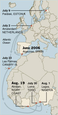
I woke up this morning to read this article in the Times about a tanker named Probo Koala that recently dumped hundreds of tons of toxic waste in the suburbs of Abidjan, the capital of Ivory Coast. The tanker, leased by Trafigura, one of those vague multi-national corporations dealing with oil, minerals, and various front companies that disguise its questionable business practices, apparently had been turned away from various ports throughout Europe due to the extreme toxicity of its cargo. Trafigura was unwilling to pay the roughly $300,000 necessary to adequately dispose of the waste, and the company instead opted to dump it in Ivory Coast, where costs are much lower and fewer questions are asked. Now the Ivory Coast is crippled with a massive public health crisis (85,000 sick) and faced with growing political instability as the population demands some explanation for their misfortune (the prime minister has already resigned). Needless to say, this is already a volatile corner of Africa, where it often takes much less than a large-scale environmental and health crisis to spark conflict and unrest.

The story -- reported fantastically, by the way, by Times reporters Polgreen and Simons -- reminds me of Don DeLillo's book Underworld, his 1997 masterpiece that chronicles the Cold War through, among other things, the lens of the global waste industry. DeLillo's book is haunted by a recurring, almost sublime image of a super-tanker that perpetually travels from one global port to another, endlessly but unsuccessfully seeking to unload its cargo of the world's most toxic waste. The diagram of the recent travels of the Probo Koala contains no such sublime quality, but it eerily recalls the darkness of DeLillo's fiction, with the ship's trail literally rendering the devastating, grotesque dark side of globalization.


Both the provenance of the waste and the ownership of the tanker itself are unclear. With a sentence that could be lifted directly from DeLillo, the article matter-of-factly explains the waste's origins: "It came from a Greek-owned tanker flying a Panamanian flag and leased by the London branch of a Swiss trading corporation whose fiscal headquarters are in the Netherlands." What?

Clearly something is wrong with the paradigm of globalization as it exists today. Maybe people will start understanding this before it gets too late? Maybe the devastation in Ivory Coast will somehow have a positive long-term effect as it galvanizes global powers to right these terrible wrongs and mitigate the destructive tendencies of global capitalism?

link: "Global Sludge Ends in Tragedy for Ivory Coast" by Lydia Polgreen and Marlise Simons, in the New York Times

01 October 2006

on the fifty state strategy

We interrupt the standard stream of architectural commentary for one of our periodic political posts. I know some readers may not be interested, but you'll just have to deal: the next five weeks will play a crucial role as this country decides whether or not to renew a commitment to the stale status quo that has been in place for the past six years. The midterm elections are on November 7, and they represent a chance for the Democrats to take back at least one house of Congress, thereby sending a clear message that enough is enough, that the present conduct of government is no longer acceptable. Much talk has been made of the similarities between this year's political climate and that of 1994, when the Gingrich-led Republican insurgency captured both the House and the Senate. Notwithstanding these seemingly favorable prospects for Democrats, there are nonetheless important differences between the Republicans of 1994 and the Democrats of 2006, and a Democratic takeover is far from certain.
I just read Matt Bai's article in today's New York Times Magazine, which delves into the trials and tribulations of Howard Dean and his efforts to rebuild the Democratic Party. Read it. Let me know what you think. It seems obvious to me that Dean's fifty state strategy is the only way to reinvent the Democratic Party as an effective and potentially victorious political force. It's a long-term vision that is not incompatible with electoral success this November, contrary to the claims of Dean's critics within the party. Its strength lies in its rejection of the red state / blue state dichotomy and the appropriation of time-tested Republican techniques of widespread, local organization. It makes sense to learn from those who win elections, and after 2000, 2002, and 2004, it's time for a change. Sure, Dean may be a "flawed visionary" (Bai's words), but he's a visionary nonetheless.

link: "The Inside Agitator" by Matt Bai, in the New York Times Magazine

21 September 2006

eikongraphia

Michielangelo recently has re-launched his blog as Eikongraphia, an updated version of his ongoing investigations into the role of iconography in architecture. I've definitely enjoyed Michiel van Raaij's thoughts and speculations as to how a building's iconography relates to its form and meaning -- his commentary is hard to categorize but easy to appreciate. The basic premise consists of short vignettes that take on a building strictly on iconographic terms (some of my favorites include the Penis and Vagina entries), thereby attempting to reconcile traditional formal concerns with a building's actual lasting effect -- essentially, how it is consumed by its observers. Read van Raaij's "Narrative" for a more detailed description of his methodology. While I do have some concerns with reading a building simply as an object for consumption, I am intrigued by the notion of "iconicity" (a term I presume coined by van Raaij? I've never come across it before) as an architectural quality to be pursued, or even perfected. It potentially offers a new, post-Venturi Scott-Brown way of understanding architectural form, and I'm curious to see how it plays out -- and if the politics of form/iconography will come into play.

link: Eikongraphia

20 September 2006

artkrush 41 / boeri

Check out the new issue of Artkrush (their third architecture issue) - there's an interesting interview with Stefano Boeri (of Boeri Studio, Multiplicity, and editor of Domus) in which the Italian architect talks about some of his myriad research endeavors throughout the globe. I've always had a few misgivings about Boeri's methodology -- which essentially consists of obsessive and exhaustive documentation of super-local conditions -- as it walks the fine line between studied observation and sensationalist exploitation (dare I say exoticization). While I know that Boeri's intentions are of course not to exoticize or exploit, and I appreciate his rigorous explorations of emergent urban conditions, there is always a certain ambiguity in my mind about who is actually benefitting or profiting from the research.

Regardless -- the interview is pretty interesting. In relation to my own concerns, I found this excerpt on Boeri's intentions particularly compelling:

I believe that the act of observing, describing, and interpreting the built environment helps us understand the community we inhabit. And I believe that the landscape — the territory continually defined by our movements, reinvented by our desires, punctuated by what we build — is an excellent metaphor for our society. The local is a treasure chest rich in details and clues that tell us about the forces that permeate our daily lives, forces that at times are manifest in the space that surrounds us, perhaps just for a few instants, like footsteps in the snow. Architecture's political dimension is not to be found in the labels we attach to our projects, nor in our magniloquent political declarations; rather, it lies in the production of useful and critical knowledge about the world that surrounds us — knowledge that is useful because it is critical.
I also am intrigued by Boeri's interpretation of borders and boundaries as potential sites for intervention and action: "I try to conceive of boundaries as the sensors of contemporary world dynamics — dynamic 'devices,' which vibrate with the energy and resistance that drive current history." Since it seems that the world we live in is increasingly defined by different degrees of boundaries and "devices" of separation, it makes sense to pursue architectural strategies that subvert and redirect these divisive phenomena towards a more productive purpose. The question is: how?

14 September 2006

complexity and contradiction, revisited

[all photos: Venturi Scott-Brown Associates]

I had a chance to swing by Columbia last night for a presentation by Bob Venturi, followed by a discussion between the architect and GSAPP dean Mark Wigley. You are probably rolling your eyes, since I seem to always have Venturi and his wife/partner Denise Scott-Brown on my mind. But indulge me once again -- there were some interesting moments worth sharing.

The event was loosely structured as a celebration of the 40-year anniversary of the publication of Venturi's seminal debut book, Complexity and Contradiction in Architecture (1966). For those who haven't read this -- you should. It is absolutely one of the most essential texts (along with Venturi's 1972 follow-up, Learning from Las Vegas, co-authored with Denise Scott-Brown and Steven Izenour) for understanding the predicaments facing contemporary architecture. After a stirring introduction by Lee Bollinger, Columbia's president and Venturi's old client back at Michigan, Venturi began with some brief reflections on both the book's inception and critical reception. Reiterating comments he has made over the years in various articles and symposia, he insisted that interpretations of the book or of him as being anti-modern or postmodern are completely misguided. This has always been pretty clear to me -- the book, while celebrating the immense stylistic diversity of historical architecture, by no means prescribes a specific style. Rather, it advocates an approach of celebratory, almost hedonistic, eclecticism -- or what Venturi likes to refer to as mannerism. While much of VSB's architectural production has involved neoclassical elements or historical references, the style itself is arbitrary and almost besides the point. [And furthermore, in line with Venturi's claim last night that Complexity and Contradiction ultimately affirmed a functionalist approach to architecture, almost all of the VSB work follows a strict functionalist paradigm of boxy, ultra-efficient floorplans that often divorce service spaces from served spaces. A reference to Kahn, no doubt, to whom Venturi also paid tribute tonight. The functionalist imperative appears again and plays a huge role in Learning from Las Vegas.] Anyway, the point is that it's understandable why historicist postmodern architects latched on to Complexity and Contradiction as justification for their stylistic carelessness, but the sweet irony is that, in true form, they completely missed the intricacy of Venturi's argument.


The discussion consisted mostly of Wigley's characteristic wizardry with words that seemed to completely baffle poor old Bob. He essentially asked the same question -- why did you write Complexity and Contradiction? -- a dozen times in a dozen different ways. The hope was to elicit some sort of polemical commitment to manifesto-writing and the activist potential of theorizing (to which I fully subscribe), but Venturi simply refused to cede Wigley any ground, insisting that the book grew out of his lectures for a theory class he was teaching at Princeton in the early 60's. I wondered if Wigley was actually talking less about Venturi and more about himself: if he was trying to posit a projective role for the writer in order to justify his own career as a non-practicing architect. Maybe that's getting a little too Wigley-psychoanalytic. Who knows. Anyway, the banter continued at length until Denise Scott-Brown, who, like the rest of us, could not take any more of the labyrinthine inquisition, finally decided to tell him what he wanted to hear. "Bob writes to figure out what he thinks," she said, explaining how the writing indeed came to inform their practice. Whether she was actually sincere, or whether she was just doing us all the favor of neutralizing the debate, I'll never know. But her brief words made me want more. Even though the event was nominally in honor of Complexity and Contradiction, which Venturi wrote solo, I realized (yet again) that Venturi without Scott-Brown is really only half the story.


The most interesting part of the evening was Venturi's emphatic characterization of his own writing as purely pragmatic and realist, as opposed to purely idealistic. In other words, he claims the basis of his learning and his analysis is always the existing conditions, the ordinary, the "real" world as it is, and that conclusions are never drawn from any preconceived ideologies. Hence the "Learning from..." technique that proved so crucial in the later collaboration with Scott-Brown and Izenour.

Clearly this enchantment with the messy realities, chaos, multiplicities, and vibrancies of everyday life is what really defines the Venturi Scott-Brown legacy. It certainly explains why I identify so strongly with their work. And seen in that light, it becomes evident why a school like Columbia would kick off its heavy-hitter lecture series with an event honoring good old Bob Venturi, who is still considered a postmodern pariah by many orthodox practitioners of architecture. It's definitely time, as architects as diverse as Koolhaas and FAT have come to realize, to reconsider the Venturis and their influence over the past forty years. Not only are they "back," as I've said - but maybe they never actually left.

12 September 2006

five years after

[image: New York Times]

AS I SAT TODAY in my office, a block from Ground Zero, with the constant drone of bagpipes echoing up from the memorial ceremonies below, I couldn't help but reflect on the terror attacks that so changed the world five years ago. Yet perhaps due to the weather -- so, so eerily reminiscent of that crisp fall morning in 2001 -- I began to ponder that maybe things haven't really changed that much. I started to think about accountability, and about how everything that has spun out of control since the Trade Center fell -- Afghanistan, Iraq, Abu Ghraib, Guantanamo, countless terror attacks around the globe -- can in a certain sense be traced back to a crisis of accountability. And then of course I saw this image of the ground zero site as it exists tonight, still a gaping hole in the city, such a fitting metaphor for the failures and missed opportunities of these last five years.

I often write of the architect's ethical imperative to design responsibly in a world of increasing irresponsibility. The stakes are even higher now, believe it or not, than they were five years ago, and it's pretty clear that architecture is ever more implicated. If we assume that every building imagines a better city (and, by extension, that every city imagines a better world), then what does the above image have to say about our future? Do we accept this status quo? Or do we insist it changes?

On that note (sort of), for those of you in Arizona, Delaware, Washington DC, Maryland, Minnesota, New Hampshire, New York, Rhode Island, Vermont, or Wisconsin, don't forget that tomorrow (Sept. 12) is primary day. It's important. As a New Yorker, I'll be using the primary as an opportunity to make a statement, to demand a measure of accountability that seems to have vanished. Of course there is no chance of unseating the all-powerful Senator Clinton -- and, indeed, I'm not so sure that our long-term interests would be best served by replacing her with Jonathan Tasini, her under-qualified, anti-war challenger for the Democratic nomination. But a vote for Tasini offers a chance -- if admittedly futile -- to make a simple statement in protest of a legislator who made the wrong choice in supporting a very wrong war. [The previous two sentences reveal the constant debate between my inner pragmatist and inner idealist. I apologize.] A wise man once told me that democracy is not a spectator sport; voting is not a privelege, but a responsibility. It is our duty as citizens to make known such grievances to our elected representatives, and I can't imagine a better way for Mrs. Clinton to understand the gravity of her misguided support of Bush's war than to see her supposed invincibility diminish by a few percentage points in tomorrow's primary. See you at the polls!

PR


07 September 2006

ground zero update: fosters, rogers, maki join the mix

This morning, Silverstein released images of Towers 2, 3, and 4 at the Trade Center site... at first glance, I must confess a hesitant fondness for the slight dissonance of the three towers, as they relate to each other and to the massive Freedom Tower. Although I still question the rationale of providing (in addition to the Freedom Tower) three additional office buildings that each approach (or reach, in Foster's case) the size of the Empire State Building, I do appreciate the heterogenuous quality of these latest images. The real problem for me, however, goes beyond form and has everything to do with program. The bottom line is that Lower Manhattan really doesn't need such a smorgasboard of new office space. Ask any New Yorker and they'll concur: the city needs housing. Until issues of affordable housing are put on the table, and until the city and state manage to pressure Silverstein & Co. to address some sort of social agenda (beyond the trite reliance on jingoistic iconography), no superstar architect, however skillful or progressive, will be able to make a positive impact.

link: "Designs Unveiled for Freedom Tower's Neighbors" by David Dunlap, in the Times

06 September 2006

blog radar :: 6 september

A quick post to mention two noteworthy blogs that I recently came across:

  • Exquisite Struggle , Andrew Faulkner's periodic ruminations and "reflections and Radical Critique on Architecture, Urbanism, Philosophy, and Daily Life." What hooked me was today's post on Paris Hilton. A must-read.
  • Tenuous Resilience, an endeavor by Evan Chakroff, an architecture student at Ohio State. The latest post is a thoughtful reflection on building codes and other architectural (and non-architectural) manifestations of the "illusion of safety." As Chakroff laments such illusions for limiting the thrill and dynamism produced by the threat of danger, he touches on (but never actually mentions) an age-old architectural preoccupation: the sublime. What seems most provocative to me is how he links this notion of the supressed sublime to a larger political imperative -- and by doing so, shows quite clearly that the aesthetic experience (or its repressions) is always fundamentally political.
At first glance, these two bloggers both seem to promise plenty of polemical commentary and critique... I look forward to future provocations!


23 August 2006

SANAA in Toledo

[all images: six million dollar man's flickr site]

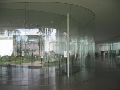
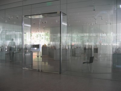
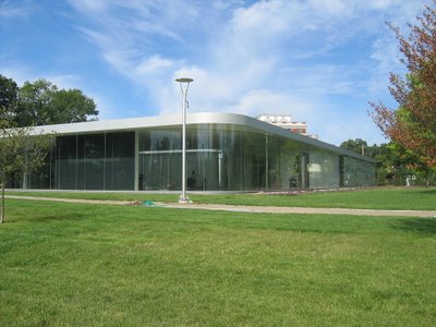
Check out Christopher Hawthorne's review of the brand new Glass Pavilion at the Toledo Museum of Arts, designed by Kazuyo Sejima and Ryue Nishizawa.

Their joint venture, SANAA, is known mostly for their highly refined, exquisitely detailed mastery of glass, which often produces other-wordly effects of transparency, layering, and pure visual fascination. I've never had the opportunity to see Sejima and Nishizawa's work in person -- although I eagerly await their forthcoming New Museum on the Bowery in New York -- but from what I can tell, there's something going on in their architecture that really distinguishes them from the rest of the contemporary field. I'm not really sure what it is yet. Something to do with an understated play with reflection, light, and visual relationships. But not in the modernist mode -- rather, SANAA operate with a completely postmodern sensibility. And I'm not talking about the disorienting, blingy, hall-of-mirrors postmodernism espoused by people like John Portman and theorized by people like Fredric Jameson, or the ridiculous Wallpaper magazine, empty neo-modernism that Hawthorne accurately criticizes. This work is much more hands-off and open to interpretation, and there is always much more to their projects than meets the eye. As you can tell, I'm having trouble verbalizing the appeal of their work -- as is Hawthorne, who suggests a contrast between SANAA's architecture and the bland minimalism that we find everywhere but, like me, fails to explain exactly why they're different. That's the point though. It's the irreducibility, the confusion, and the refusal of this work to be pigeonholed that makes it superb.

16 August 2006

"welcome to america"

For those who haven't heard this ridiculous story about this year's Senate race in Virginia, read this article. Apparently the esteemed incumbent, Senator George Allen, famous mostly for his father's role as a Washington Redskins coach, made a major racially-motivated gaffe at a campaign event over the weekend in a small town in southwestern Virginia (video here). The controversy comes from comments directed to S.R. Sidarth, a college-age volunteer for the campaign of Allen's Democratic opponent, Jim Webb, who is trailing the Allen campaign with a video camera to unobtrusively research the other side's speeches and strategies (a common campaign practice across the country). In the midst of a stump speech, directly after claiming that his campaign is "run on positive, constructive ideas," Allen began to address Sidarth, who happens to be a U.S.-born citizen of Indian descent, as "macaca," a derogatory term that he proceeded to repeat again -- indicating it was more than just a phonetic mispronunciation. Allen then followed up with "Welcome to America, to the real world of Virginia," implying falsely that both Sidarth and his candidate are strangers to nation and state. What most Virginians will (or should) realize is that this latest mishap follows Allen's long history of racial insensitivity, including episodes of Confederate flag worship and displaying a noose in his office. And regardless of any past offenses, this weekend's outburst reveals Allen to be an obnoxious bully (for lack of a better word), eager to single out the only non-white person in a political gathering and take advantage of that person's difference.
Now, if this were any normal election year, I would say who cares, he's going to win anyway, it's one of the reddest states in the union. But this isn't any typical year, and the Democrats are not running a typical candidate. Jim Webb is a former Republican, former Secretary of the Navy under President Reagan, and a conservative, pro-defense, anti-war alternative to the stale status quo of George Allen, who has done absolutely nothing over the last six years for either the state of Virginia, the country, or humanity. The race is still a long-shot at best for Webb, but perhaps this latest episode will mark the beginning of the end for Allen. The bloggers certainly won't let it die, and I think we've seen already in Connecticut that their political clout is not to be underestimated. Who knows. This is all to say (in too many words, as usual) that if you live in Virginia, you should not only vote for Jim Webb, but you should help his campaign in any way possible. And if you don't live in Virginia, check out his site anyway, and maybe you can help too. Maybe then, come November 7, we can all welcome George Allen to "the real world of Virginia" on his way out of DC and into retirement.


"he has always been better at rhetoric than architecture"

Following up on an earlier post: Christopher Hawthorne reviews Eisenman's new stadium for the Arizona Cardinals.
link: "Grass isn't greener" in the L.A. Times

14 August 2006

blog radar :: 14 august

Just catching up the highlights of my Google Reader feeds these past few weeks:

  • BLDGBLOG. Geoff Manaugh has kept up a constant stream of noteworthy posts, including the Kazys Varnelis interview noted previously, speculation on "landscape theology" (whatever that is) in an interview with Erik Davis, and a feature on inflatable/biodegradable toilets for refugee camps by Studio Cycle.
  • Subtopia. Another blog with consistently high-quality posts, ranging from border station design ( "Welcome to America") to refugee urbanism in Israel and Lebanon ("War as Vacation" ) to a review of an exhibition on the city of Tijuana ("Strange New World" ). The recurring theme of border urbanism reminds me of an article in the most recent issue of Log (#7) by Marie Aquilino ("Free Zone: A Conversation with Amos Gitai"), which addresses Gitai's film "Free Zone" and the the strange phenomena of free-trade cities, particularly Zarqa City in Jordan, a hub with links to the borders with Iraq, Syria, and Saudi Arabia.
  • The fallacy of New Urbanism. From Planetizen, Leonardo Vazquez has written an article ("Urban Fables: The Role Of Storytelling And Imagery In Successful Planning Movements") on how the New Urbanist movement has ap propriated religious strategies of allegory and myth to further their cause. Vazquez compares the New Urbanists to the conservative property rights movement (in terms of their similar appeals to " people's hopes, fears and beliefs") -- while this is certainly right on the mark, I would go further and say that New Urbanism not only takes hints from property rights activists, but in fact operates in an almost identitcal manner as the broader political and religious right wing. Readers of this blog have heard me rant previously on the convergence of New Urbanist and conservative political ambitions in the wake of Hurricane Katrina. I must say that there is a certain satisfaction in seeing other writers not only comment on the ultimate fiction of New Urbanism -- its false nostalgia for a past that never existed in the first place, as I like to say -- but also relate it to the fictions (and, dare I say, untruths) that underlie the contemporary right-wing agenda in this country.
  • Niemeyer still going strong. From Tropolism, some cool photos of Oscar Niemeyer's latest project, a theater in Ibirapuera Park, São Paulo. Looks like the old guy still has it...
  • Keller Easterling talks. An Archinect feature: Mason White interviews architect, theorist, and Yale professor Keller Easterling about her writings and practice. From having seeing Easterling's lectures and having her on a couple reviews while at school, I've always been intrigued by her fascination with such strange things as third-world golf courses, cruise ships, and industrial tomato farms. I've been meaning for a while to check out her latest book Enduring Innocence -- check out the interview for a taste.
  • Why Sylvia Sucks. From Michielangelo, a humorous yet enchantingly critical review of a lecture by Sylvia Lavin. I won't go into the details, but topics include iconography, dildos, and pet rocks. Worth checking out.

bldgblog: interview with kazys varnelis

BLDGBLOG continues its recent string of fantastic posts with Geoff Manaugh's interview with Kazys Varnelis, of AUDC and the newly formed Network Architecture Lab at Columbia's GSAPP. Check it out. I was lucky enough to see Varnelis's talk at the Philip Johnson symposium in Yale back in February, which reframed Johnson's career as a series of powerful social and professional networks, and which used Johnson's AT&T Building project from the 80s as a narrative framework for the critique (read the paper here). Varnelis's new position at the GSAPP represents one of Mark Wigley's first new major hires for the history/theory curriculum since his accession to the deanship two years ago, and I think it's definitely a smart pick-up for the school... Varnelis will join the likes of Frampton, McLeod, Ockman, and Reinhold Martin -- already quite a strong bunch -- and hopefully his addition to the faculty represents a renewed commitment to the critical approach espoused by these folks over the years. If nothing else, the NetLab is evidence of Wigley's ever-so-slight shift away from the digital form-obsessed Tschumi years towards a more politically, socially, and ethically conscious form of architectural education. Can't wait to see how it all plays out...

link: "The Logistics of Distance: An Interview with Kazys Varnelis", at BLDGBLOG

10 August 2006

"dynamism tamed"


Ouroussoff's review in today's Times of Peter Eisenman's new Cardinals stadium misses the point by focussing primarily on the architect's compromise between formal innovation and pragmatic realities. First of all, it's a fallacy to give Peter Eisenman any recognition for reinventing the stadium typology, as Ouruossoff seems to do. A football stadium is a football stadium, and this one seems no different. Sure, the motorized field that slides outside the air-conditioned stadium for sunlight and rain is pretty cool and innovative, and it could even be spun as some sort of contemporary, mega-futuristic folly (although one that reflects poorly on our culture's environmental and land-use priorities). But there is no attempt on Eisenman's part to question stadium convention in any formal or programmatic way. An earlier scheme included a somewhat more interesting attempt to integrate the facade slots into the landscape, but apparently that quietly fell prey to value engineering. The final product clearly demonstrates Eisenman's true role of providing the fancy metal icing for your standard wedding cake football stadium. Indeed, the design team of Eisenman Architects and HOK Sport seems to me less a partnership and more a division of labor: Eisenman does the outside skin, and HOK takes care of everything else.

Not that there's anything wrong with that. Don't get me wrong - when I say that Nicolai is missing the point, I mean that he fails to grasp what Eisenman is really up to down in Arizona. A lifetime football nut, Eisenman is clearly having fun, designing a container for his favorite sport. The opportunity to design your own football stadium doesn't come around that often. I've heard this sentiment from the man himself at several lectures and presentations, and at 73, after a long combative career of pissing off people, wouldn't you want to kick back and work on something fun for a change?

So forget the lesson on value engineering, Nicolai. It's a stadium. A nice stadium, but a stadium nonetheless.

link: "Dynamism Tamed by Cost-Cutters" by Nicolai Ouroussoff, in the New York Times
07 August 2006

on lamont vs. lieberman

Since the Connecticut Democratic primary is only two days away, I thought I'd put in my two sense on the race between Senator Joe Lieberman and his challenger in the primary, Greenwich businessman Ned Lamont. The netroots left of course has come out strongly in support of Lamont, less for his actual merits and more for the simple fact that he is not Lieberman, and not in support of our occupation of Iraq. While many heralded the demise of the lefty blogosphere in the wake of Dean's 2004 loss in Iowa, it seems that the rumors of such a death have been greatly exaggerated. Indeed, in a remarkable turn of events over the past month or so, Lamont's campaign, supported vigorously by bloggers and online fundraisers galore, has surged beyond all expectations, with the latest polls showing the challenger with a strong lead. My fascination (and the national media's, I presume) with this particular race stems not so much from an interest in Connecticut state politics, or even for the race's ultimate effect on the composition of the next Senate. Rather, I think (and hope) that this race will have huge consequences for the overall Democratic efforts leading up to November to take back control of the House and Senate. The unexpected rise of an unknown primary challenger and the apparent collapse of one of the Democratic Party's most established and long-serving members of Congress, while having nothing to do with the typical architectural banter that typically graces these pages, has everything to do with the notion of a "progressive reaction." It's ironic that the netroots advocacy of Lamont has coopted the time-tested Republican tactic of emphasizing a single issue -- in this case, the war in Iraq -- and making the entire election a referendum on that particular cause. It's a progressive, anti-war movement operating in a reactionary manner. Will it work for Lamont and his agitated supporters? Who knows. And even if it does, will such a strategy work in the general Congressional elections on November 7? A fired-up Democractic left means one thing during primary season, but it's a whole different ballgame once you factor in the red half of America, especially in states like Missouri, Arizona, Montana, and Virgina, all states with crucial races this fall. Again -- who knows.

All bets are off for Tuesday's race: I certainly would not underestimate Joe Lieberman's organization, election day GOTV efforts, and his capacity to come back from behind. Not to mention his potential candidacy as an Independent, which would be difficult for Lamont to overcome in November. But if I were a resident of the great state of Connecticut, would I take a risk, reject a more or less decent Senator who has spent his whole political career advocating causes with which I identify, and rashly embrace some no-name millionaire who has offered nothing coherent save for a staunch opposition to our military presence in Iraq? You bet I would. Enough is enough: it's time for the Democratic Party to realize that it not only has the potential to regain the majority, but that it already represents the majority. Most Americans want to fix the mess in Iraq; all they need is someone to offer them a way out and a valid alternative to the horrid status quo that reigns in Washington. It's time.

05 August 2006

more on sam jacob + VSBA

Following up on an earlier post: I just came across another piece by Sam Jacob (of England's FAT), which somehow I missed during previous visits to his fantastic site. As I've written about previously, Jacob again embraces Venturi and Scott Brown, he suggesting an atypical (yet nonetheless insightful) interpretation of their career. Although he confesses a fondness for their built work (including the Acadia Summer Arts Program, pictured above), the true root of his admiration (and mine, for that matter) seems to be on a larger ideological and polemical level. It becomes less about that problematic label of "postmodernism" and more about a deeper modus operandi of "Pop": not the standard definition of Pop that we all learned about in Art History class, but rather (in Jacobs' words) "a kind of socially engaged Pop -- a Pop that isn't only fast, fun and ironic, but political and moral as well."

Why, you ask, does the progressive reactionary keep babbling on about Venturi, Scott Brown, and all their followers? Well, for one, it's all about the attitude. The mentality. For me, there's something inherently political -- both progressive and reactionary -- in the act of embracing what the establishment deems garish. Challenging the status quo of contemporary architecture, regardless of formal or stylistic preference, is always a positive thing. Or maybe my affinity for the work of VSBA and FAT stems from a more personal anxiety surrounding my own architecture and (in comparison) its muted blandness. Whatever the case: what it comes down to, and what Jacobs is so right about, is that we can all learn a lot from the ugly and the ordinary. After all, we're all postmodernists, and it's time we embraced it.

03 August 2006

powers of ten

Somebody was nice enough to post the entire Eames short film "Powers of Ten" on YouTube. Always fun to watch.

31 July 2006

on sustainability (briefly)


Inhabitat recently had an interesting interview with Paul Kephart (part 2 here), the executive director of Rana Creek Habitat Restoration and Living Architecture, the folks behind such green-roof icons of sustainable architecture as the Gap headquarters and the California Academy of Sciences. I must confess a certain anxiety over the term "sustainability," as it seems to have collapsed into a buzzword that too many architects and clients latch onto as some sort of empty badge of progressive merit, without truly understanding the larger issues at stake. Yet while I am certainly no expert on green architecture and sustainable technologies, I understand that sustainable practices must be integrated into the architectural status quo in order for the discipline to have any lasting relevance. It is in this respect -- the interesection of ecology and utopia -- that I value the work (and the comments) of Kephart and his firm.

The most informative aspect of the interview is Kephart's specificity with regard to sustainable methodology (again, in contrast to the mainstream, generic usage of the term). The integration of food production and waste treatment into the architecture of a building particularly seems like a no-brainer. I also appreciate the willingness to extend a building's ecological features didactically into the programmatic realm: the green roof of the California Academy of Sciences building becomes an actual exhibit, an occupiable, living habitat that functions both environmentally and educationally.

One tangential thought: Perhaps a crucial component of an ecologically utopian architecture would be to go beyond the technical details and processes that seem to preoccupy green architects, and to actually project into the future, imagining alternative uses (and abuses) of a building. Maybe designers should include such speculations as a way to grasp the full potential of these nascent practices. In a way, it reminds me of the contemporary architect's need to get over the excitement of flashy forms made possible with digital technologies and to figure out what this new technological wizardy can actually do for architecture and humanity as a whole.
And while I'm on the subject of sustainability, if you haven't seen Al Gore's documentary yet, do so.

link: "Interview: Paul Kephart of Rana Creek", from Inhabitat

25 July 2006

job well done

According to the Times, the Lower Manhattan Development Corporation has decided that its purpose is fulfilled, and its existence is no longer necessary. Brilliant. After such a fantastic job managing the master planning process at the WTC site, overseeing a stellar design selection for the Freedom Tower, supervising an incredibly smooth memorial design process, and seeing all these projects through to final completion, the LMDC indeed is no longer needed. Bravo!

link: "Downtown Rebuilding Agency Says It Is No Longer Needed" in the New York Times
14 July 2006

blog radar :: 14 july

Some quick finds I thought were worth mentioning:

  • eXtra-eXtra-Small House. Via Archinect and Arkinetia, I came across this tiny house by Slovenian office Dekleva Gregoric Arhitekti. It's an inventive solution to the challenges of a tiny urban site, smartly maximizing the quantity of indirect sunlight. Of even greater interest to me is the larger context of contemporary Slovenian architecture (a recent topic of personal fascination and research: the contemporary Balkan architecture culture explosion), about which I plan to post more in the future. In the meantime, check out (in addition to Dekleva Gregoric) Sadar Vuga Arhitekti, Bevk Perović arhitekti, and Maechtig Vrhunc Arhitekti for a taste of the vibrant architectural scene in Ljubljana (Slovenia's capital).
  • "Architectural Tetris". Geoff at BLDGBLOG has a post on a recently completed project by the Danish firm PLOT (which has now broken up into two separate firms: JDS Architects and Bjarke Ingels Group). I'm a long-time fan of PLOT's work, which generally reflects a Koolhaas influence (both partners are OMA alumni, I believe) infused with a strong playful, pop methodology that bravely shows no fear of simple diagrams (and heavy lineweights!). This particular housing complex outside of Copenhagen is remarkable less for its final image (which to me projects an unfortunate bland neomodernism, masking much of the plan's inventiveness) than for its generative strategy, which relies on a multitude of seemingly unique apartment typologies that interlock together to form the two buildings -- hence Geoff's Tetris analogy. Check out Ingels and De Smedt's websites; they produce an astonishing amount of work. Can't wait to see what comes next.
  • "Tourism Infrastructure." Via Pruned. Some cool and strangely ominous photos from John Brinton Hogan's "Vacation" series of national park info signs, scenic overlooks, and other oddities.

12 July 2006

nomadic border architecture

Bryan Finoki over at Subtopia has a good post on migrant housing and other assorted architectures, specifically on the U.S.-Mexico border. Some fascinating facts, as well as exciting insight into design work that addresses migrancy, nomadism, etc. I was especially interested in hearing about projects by Public Architecture and the Design Corps, two organizations who seem to be very committed to the promotion of progressive causes through architecture and design.... we should all learn a lesson or two from these folks.

11 July 2006

swiss bunkers


The July issue of Polar Inertia includes some gorgeous photos of alpine bunkers in Switzerland. Check it out.

blog radar :: 11 july

I've been traveling over on the left coast the past few weeks, enjoying the much more pleasant weather that seems to grace that side of the country during the summer months... hence my recent lack of posts. Some interesting tidbits that have come across my screen while on the road:
  • "A Heart of Darkness in the City of Light." Last Sunday's Times had a surprisingly scathing article (and much welcome relief from Nicolai's ridiculous, adulatory articles) by Michael Kimmelman on Jean Nouvel's new Musée du Quai Branly in Paris. The usual postcolonial critiques stand up remarkably well in the context of Chirac's France and the suburban uprisings last fall. I was especially impressed by Kimmelman's grasp of both the aesthetic and political implications of the architecture -- and how they operate hand-in-hand. On a simpler note: does anyone find this building just plain ugly?
  • Archizoo. I've been enjoying this relatively new blog for its thoughtful musings... most notable was a post on the contemporary aesthetic implications of classical of symmetry, in the context of the headquarters of SWIFT, the banking firm responsible for handing over personal information to the federal government. This raises several crucial questions (which are asked constantly on these pages) on the politics of form and the responsibility (culpability?) of the architect. [Also check out another cool post on "Tourist Meccas" that links to some incredible imagery on Polar Inertia . And another one on the architecture of space. Literally.]
  • Toyota Prefab. Via Inhabitat, some interesting facts about Toyota's recent ventures into housing production. Although it's only happening in Japan (so far) and although the design quality is medicore (so far), it's a promising step in the right direction...
  • Torture taxi mapping. From we make money not art, a provocative project of cognitively mapping the unbelievable practice of "rendition" that our government employs in order to escape accountability for human rights abuses in the "war on terror."
  • Bell Labs to go. Via Archinect, word of the impending doom for one of Eero Saarinen's landmark projects from the late '50s. It's interesting how this story hasn't received much coverage -- perhaps it's due to the poor state of affairs at the lab's parent Lucent (a spinoff of the old AT&T). Some may be upset about the destruction of such a productive hotbed of technological innovation (birthplace of cellular telephony, among other things), but what about the architecture itself? Maybe its demolition will give a much-needed jumpstart to the modern preservation movement (the preservation of Modernist buildings, that is). On an unrelated note, it would be interesting to see how the fate of this particular building fits into Kazys Varnelis's long and fascinating tale (as told at the Philip Johnson Yale conference in February) of AT&T's centrifugal disintegration as it relates to the corporation's architectural ventures. Another day...
  • New Orleans commentary . The latest from our friends at Architecture and Morality is a thoughtful reflection on two recent design initiatives regarding post-Katrina New Orleans: the Architectural Record housing competitions, and the superstar-packed exhibition in the Netherlands organized by Reed Kroloff. While I agree with the points about the neglect of community involvement and the tendency to fall back on less-than-successful historical models, I think Corbusier's critique fails to acknowledge the importance of imagination and -- indeed -- fantasy in the process of rebuilding New Orleans. The quick dismissal of the (what I assume to be) intentionally utopian schemes of UN Studio, MVRDV, and the "floating cube" citation-winner of the low-density housing competition represents a lack of commitment to the notion of imagining a different (and better) future for the city. Of course these schemes -- the artificial mountain, the monstrous ziggurat, the floating housing -- are not intended to be understood as literal remedies. They are provocative musings, meant to spark new ideas about how to address the survival of this impossible city. If we as architects can't even do that, then what hope is there?

28 June 2006

blandness at ground zero, cont'd

David Childs and SOM just revealed the updated design for the Freedom Tower. Seems they've converted an oppressive 187 ft. metal-covered concrete base to an oppressive 187 ft. glass-covered concrete base. Brilliant.

link: "Architects Unveil New Design for Freedom Tower" in the New York Times

26 June 2006

portmania

Aric Chen resurfaces (after his departure from the Architect's Newspaper gossip column) in today's Times with a piece on John Portman and his many super-hotels. I must confess a certain awe/admiration for Portman's spaces -- on more than one occasion, I have wandered around the Marriot Marquis in Times Square just for the hell of it, watching those retro-round elevator pods shoot up into the impossible atrium/void. In this respect, I definitely sympathize with Koolhaas's simultaneous contempt and fascination with Portman's hotels -- and I think his suggestion in S,M,L,XL of the isomorphism between Portman's voided hotels and the decentered nature of Atlanta offers quite a strong critique of both. (Yet I should note that I think the true source of Koolhaas's admiration of Portman is not the architecture, but rather the megolomania.) Of course, Koolhaas was not the first to appropriate Portman as a symptom of broader cultural developments; Fredric Jameson's seminal 1984 article "Postmodernism, or The Cultural Logic of Late Capitalism" introduced Portman's Bonaventure Hotel in L.A. as the archetypal "postmodern hyperspace," with its "milling confusion" of the bewildering atrium, elevators, escalators, and aimless wanderers. Chen hints at the Jameson text when he mentions the labyrinthine, disorienting nature of Portman's spaces, but mostly his commentary presents a watered-down interpretation of Portman's architecture, with lines like the following: " Their cylindrical tinted-glass towers sparkled atop concrete podiums, while inside, ficus-filled Xanadus of flying walkways, spiraling stairs and cantilevered terraces were waiting to be discovered — an ideal habitat for the modern nomad in search of a well-garnished cocktail." Surely there's more to modern nomadism, and more at stake in Portman's hotels, then the quest for booze? Too bad Chen didn't delve deeper... but then again, it's just a Travel section article.

link: "The Kubla Khan of Hotels" by Aric Chen, in the New York Times

20 June 2006

new digs in baghdad


Some quick facts about the new United States Embassy currently under construction in Baghdad:

  • 104 acre site
  • $592 million (more than the price tag for the WTC memorial complex)
  • intended to house, feed, and entertain 8,000 employees
  • construction is contracted out to a Kuwaiti firm known for questionable labor practices
The Nation has a characteristically over-the-top piece on the embassy that nonetheless gets the point across. My favorite excerpt:
Democrats demanding an exit strategy from Iraq are routinely derided by the Bush Administration as cowards who "cut and run." But if this Embassy plan is not a form of cut and run, what is it? Instead of cutting and making a run for Kuwait, they intend to cut and run into what amounts to the world's largest bunker, a capacious rat hole where they can wait in safety until all the Iraqis have killed one another or all factions unite, march on this air-conditioned citadel and slit the throats of its irrelevant inhabitants.
link: "Bush's Baghdad Palace" by Nicholas von Hoffman, in the Nation
link: "Giant U.S. Embassy Rising in Baghdad" by Barbara Slavin, in USA TODAY

blandness at ground zero

The LMDC today released new plans and images for the revised WTC memorial. The design has successfully been whittled down from Michael Arad's original (if boring) competition-winning scheme to an exercise in total blandness and gutlessness. Just another fantastic product of design-by-committee. The amazing thing is that the primary impetus to reduce the design's ambition was to reduce costs -- to below a $500 million price tag. $500 million, and this is what they came up with? Two square reflecting pools and a grove of trees?! It all makes me long for the mediocrity of the original scheme.

link: "New Plan Unveiled for W.T.C. Memorial" in the New York Times
link: Lower Manhattan Development Corporation

18 June 2006

progressive reactionary cartography


This website represented as a network of links, tags, connections, etc. [Websites as Graphs via BLDGBLOG]

new urbanism for the military

Via Subtopia and Planetizen: An article in the Times about the Villages at Belvoir, a new collection of New Urbanist housing development on the grounds of Fort Belvoir in northern Virgina. Strange bedfellows? Not really. It makes sense that Rumsfeld's Department of Defense would want to hire the most prestigious of our nation's reactionary architects to design new housing for military bases. While the ambition to provide new and better housing stock for men and women in uniform is admirable, isn't it disturbing that the Army would enthusiastically embrace a stage-set architecture of false nostalgia?
link: "New Urbanism: It's in the Army Now" by William Hamilton, in the New York Times

17 June 2006

a fence with more beauty

The Times has asked a handful of architects to propose creative responses to the U.S. - Mexico "border fence" that surely, in one form or another, will play a part in the immigration reform legislation currently under debate in Congress. It's an interesting premise, and a worthy attempt by the Times to inject some sort of creative or imaginitive impulse into what promises to be a purely functional, fortress-like endeavor. Unfortunately, both the journalistic effort and the architectural responses fall short. The most provocative ideas come from landscape architect James Corner, who has proposed a large-scale hybrid of heavy industry and green infrastructure as a way to activate the border and transform a place of conflict into a zone of production. These conversations, however, should be taking place beyond the pages of the Week in Review section of the New York Times. Progressive politicians should stop bickering over whether this fence will take shape and should immediately start brainstorming about exactly what shape it will take. Of course, if I were to make a wager, I'd say that our impending border fence would resemble more Israel's West Bank barrier than Corner's utopian imagery, but it doesn't hurt to hope for something better, right?
link: "A Fence With More Beauty, Fewer Barbs" by William Hamilton, in the New York Times

a new new media?

Markos Moulitsas Zúniga (the "Kos" in Daily Kos) has a brief piece in the Nation in which he suggests that there is a paradigm shift currently underway that threatens the dominance of traditional media. The rise of blogs, wikis, podcasts, etc. truly offers a new empowerment to individuals, says Moulitsas, and the true potential for progress lies in our ability to master these new communication tools and translate broadcast power into political power. Yes, we've heard it all before -- about how the Internet will usher in a new age of democracy, the ultimate forum of free expression, etc. etc. But one wonders: maybe Moulitsas's observations are quite timely? Maybe now is finally the moment where the ability for individuals to deliver their own "great content" (his words) finally does threaten the hegemony of corporate Big Media:
We need to focus on making sure progressives learn to use the tools of this new media landscape. That's where the new-century media wars will be fought and won.
It's an election year, folks... and an important one. Time to take it up a notch.
PR.
link: "Use the Tools" in The Nation

25 May 2006

jacob's tribute to vsb

More proof that the Venturis, about whom I've mused earlier, are indeed "back." Sam Jacob, about whom I've also mused earlier, has a sharp tribute on his blog to Venturi and Scott Brown, two of my heros in the world of contemporary architecture.

link: Topsy Turvy VSBA: Inverted Heros of an Upside Down Avant Guard

24 March 2006

who is killing new orleans?

A new article by Mike Davis in The Nation goes into the politics of post-Katrina New Orleans. A good read...

link: "Who is Killing New Orleans" by Mike Davis (The Nation, April 10 2006)

23 March 2006

after the levees

Sorry for the extended hiatus... things have been a bit hectic here on the home front. Hope to be back soon with some longer thoughts (on neo-marxism, computer-aided design, and last month's Philip Johnson symposium at Yale, among other things) - but in the meantime, here's something I came across today:

Josh Marshall's Talking Points Memo has set up a new blog in their "cafe" that is focusing on post-Katrina issues. Promises to be interesting -- is it a sign of brewing discontent on the part of progressives? Maybe we can hope for a unified alternative to the right-wing establishment's plans for the Gulf coast?

link: After the Levees

05 March 2006

lower manhattan

CHECK OUT Miss Representation's site for a straight-up recap of last week's meeting of the New York New Visions committee at the Center for Architecture. M.R. pretty much sums up the sorry state of affairs downtown, accurately comparing the LMDC / Port Authority spin to the kind of manipulative and mystifying PR perfected by Karl Rove. Seems like the chances are getting slimmer for any significant progress -- architectural, political, whatever -- to be made in Lower Manhattan. But nevertheless: as the chances get slimmer, the stakes get higher, and it becomes that much more important for those of us who care to propose alternatives.

link: "Nothing to see here, folks" from Miss Representation

22 February 2006

working for nothing (cont'd)

Following up on an earlier post on the inexcusable practice of unpaid architectural labor: PartIV has discovered that Foreign Office Architects, an office emblematic of the ambitious, talented, and selfish (borderline abusive) architect unwilling to pay their employees, actually made a £786,798 profit in 2005. For shame, FOA! And bravo, PartIV for such brilliant financial research!

link: FOA's 2005 accounts, posted on PartIV